Social distancing: evidence of privilege in a pandemic from smartphones
Nabarun Dasgupta, MPH, PhD | nab@unc.edu | @nabarund
Dr. Dasgupta is an epidemiologist at the University of North Carolina in Chapel Hill. He studies population level patterns of infectious disease, medication safety, and opioids.
Thanks to Ben White for data munging help. Code available on GitHub.
Co-authors
Michele Jonsson Funk, PhD
Allison Lazard, PhD
Benjamin Eugene White
Steve W. Marshall, PhD
On March 23, 2020 Stuart Thompson and Yaryna Serkez of The New York Times published a fascinating use of cell phone GPS signal information to gauge movement and commuting, during the advent of social distancing. They compared the state-level data in a slick graphic to political leanings. But we wanted to understand more about other community level characteristics of slow versus fast adopters.
We were provided access to the same location dataset on social distancing published today in the. We used a data merging approach we have previously published. Repurposing code from an ongoing project, we merged in community-level data from the Robert Wood Johnson Foundation's County Health Rankings. This very rich dataset contains dozens of explanatory variables about health, social, and economic indicators.
The main finding is that counties that did the most social distancing were wealthier and healthier in a wide range of ways. This structural advantage may be central to being able to isolate.
display "Notebook generated on $S_DATE at $S_TIME ET"
Models
// Load pre-procesed data
clear all
set scheme economist
use "https://github.com/opioiddatalab/covid/blob/master/analysiset.dta?raw=true"

// Create results frame
frame create results str20 strat level avg LL UL

// Program to invert differences
program define invert, rclass
    version 16
    args ee ll ul

    di round((1-(1/`ee'))*-100,.1)
    di "LL: " round((1-(1/`ll'))*-100,.1)
    di "UL: " round((1-(1/`ul'))*-100,.1)
end

// Set up negative binomial model
program define modelrun, rclass
    version 16
    syntax varlist(numeric)

    frame change default
    foreach var of local varlist {

    di "----- RURALITY-ADJUSTED NEGBIN MODEL -----"
       nbreg `var' levels* homeorder i.rucc, irr nocons vce(r)

    * Store results
        frame post results ("`var'") (1) (round((r(table)[1,1]),.1)) (round((r(table)[5,1]),.1)) (round((r(table)[6,1]),.1))
        frame post results ("`var'") (2) (round((r(table)[1,2]),.1)) (round((r(table)[5,2]),.1)) (round((r(table)[6,2]),.1))
        frame post results ("`var'") (3) (round((r(table)[1,3]),.1)) (round((r(table)[5,3]),.1)) (round((r(table)[6,3]),.1))
        frame post results ("`var'") (4) (round((r(table)[1,4]),.1)) (round((r(table)[5,4]),.1)) (round((r(table)[6,4]),.1))
        frame post results ("`var'") (5) (round((r(table)[1,5]),.1)) (round((r(table)[5,5]),.1)) (round((r(table)[6,5]),.1))

        di "Compare to tabular data:"
        table iso5, c(count `var' mean `var' sem `var')

    di "----- PERCENT DIFFERENCE MODEL -----"
    * Rate difference models
        nbreg `var' levels* homeorder i.rucc, irr vce(r)

   * Plot graph
       frame change results
       la var level "Social Distancing: Lowest (1) to Highest (5)"
       line avg level if inlist(strat,"`var'"), title("`var'")

    frame change default

    }
end

// Set up scaled Poisson model

program define modelpoisson, rclass
    version 16
    syntax varlist(numeric)

    frame change default
    foreach var of local varlist {

    di "----- RURALITY-ADJUSTED POISSON MODEL -----"
       glm `var' levels* homeorder i.rucc, family(poisson) link(log) scale(x2) eform nocons

    * Store results
        frame post results ("`var'") (1) (round((r(table)[1,1]),.1)) (round((r(table)[5,1]),.1)) (round((r(table)[6,1]),.1))
        frame post results ("`var'") (2) (round((r(table)[1,2]),.1)) (round((r(table)[5,2]),.1)) (round((r(table)[6,2]),.1))
        frame post results ("`var'") (3) (round((r(table)[1,3]),.1)) (round((r(table)[5,3]),.1)) (round((r(table)[6,3]),.1))
        frame post results ("`var'") (4) (round((r(table)[1,4]),.1)) (round((r(table)[5,4]),.1)) (round((r(table)[6,4]),.1))
        frame post results ("`var'") (5) (round((r(table)[1,5]),.1)) (round((r(table)[5,5]),.1)) (round((r(table)[6,5]),.1))

        di "Compare to tabular data:"
        table iso5, c(count `var' mean `var' sem `var')

    di "----- PERCENT DIFFERENCE MODEL -----"
    * Rate difference models
       glm `var' levels* homeorder i.rucc, family(poisson) link(log) scale(x2) eform

   * Plot graph
       frame change results
       la var level "Social Distancing: Lowest (1) to Highest (5)"
       line avg level if inlist(strat,"`var'"), title("`var'")

    frame change default

    }
end
Descriptive Results
// Basic distributions of counties and traces
* iso5 is the main outcome variable representing quintiles of mobility change

tab rucc, m
tab iso5, m
su last3_sample

di "Quintile boundaries:"
    gen last3i=last3_index-100
        table iso5, c(min last3i max last3i)
            di "Places with positive movement:"
                tab state if last3i>=0
                table state if last3i>=0, c(median last3i mean rucc)

di "US average change in mobility:"
    qui: su last3_index
        return list
di "US median distance traveled km):"
    qui: su last3_m50, d
        di r(p50)
di "US mean change in mobility:"
    qui: su last3i
        di r(mean)

di "Mean mobility change by quintile:"
    table iso5, c(count last3_index mean last3i median last3_m50)
    table iso5, c(sum last3_sample) format(%12.0fc)
        qui: su last3_sample
            di "Total traces in 3 days: "
            di %12.0fc r(sum)

di "Mean mobility change by status of homeorder:"
    table homeorder, c(count rucc mean last3i sem last3i)

di "Rurality/urbanicity by quintile:"
    table iso5, c(median rucc)

di "Small municipalities in highest tier:"
    tab state if rucc>=6 & iso5==5

di "Large municipalities in lowest tier:"
    tab state if rucc<=3 & iso5==1
Healthcare
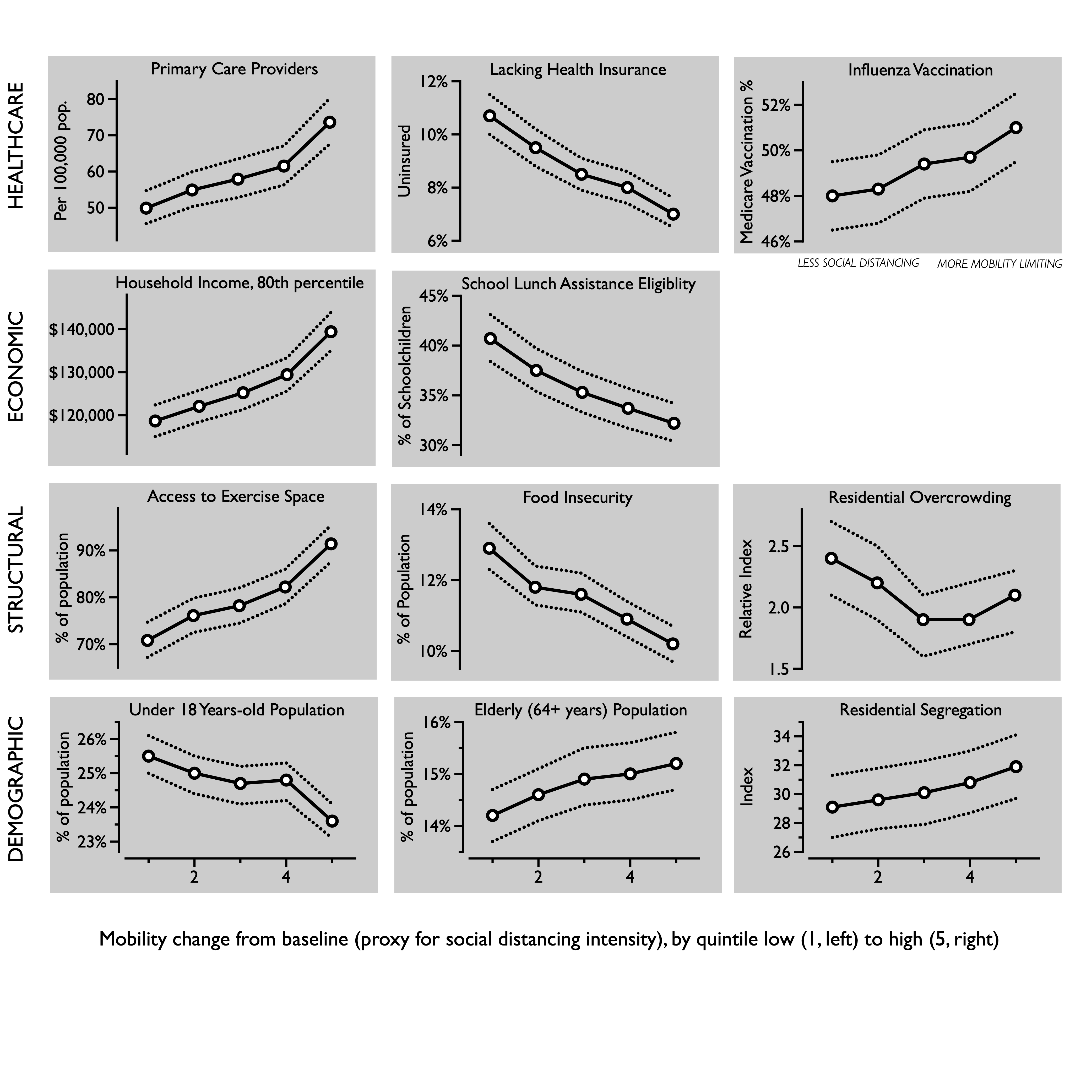
To gauge overall baseline healthcare access and utilization, we examined primary care providers per 100,000 population and percent uninsured under age 65 (e.g., Medicare eligibility). As a marker for a closely related preventive health behavior, we examined whether earlier influenza vaccination rates were associated with how much the county was likely to slow down in the current coronavirus outbreak. This was quantified as the percent of annual Medicare enrollees having an annual influenza vaccination.
Primary care providers
We wanted to see if places with more social distancing had better healthcare resources. So we looked at primary care providers per 100,000 population.
modelrun pcp_rate
Interpretation
Relative effect measures
^
     levels1 |   49.92198   2.325957    83.93   0.000     45.56514    54.69541
     levels2 |   54.89074   2.441119    90.06   0.000     50.30882    59.88996
     levels3 |   57.89873   2.709556    86.73   0.000     52.82437    63.46053
     levels4 |   61.49219   2.753973    91.97   0.000     56.32462    67.13387
     levels5 |   73.62823   3.207945    98.67   0.000     67.60175    80.19195
Percent difference
levels1 | .6780277 .0239497 -11.00 0.000 .6326751 .7266314
invert .6780277 .6326751 .7266314
The counties showing the smallest declines in mobility had 50 primary care providers per 100,000, whereas the most social distancing counties had 74 per 100,000 after adjusting for rurality and stay-at-home orders, a 47% (95% CI: 38%, 58%) difference.
Percent uninsured
Percent of without health insurance below Medicare elgibility (age 65).
// Comparing percent uninsured to social distancing
modelrun uninsured_p
Interpretation
Relative effect measures
^
     levels1 |   10.74092   .3917303    65.09   0.000     9.999938     11.5368
     levels2 |   9.464582   .3546025    59.99   0.000     8.794479    10.18574
     levels3 |   8.480079   .3192442    56.78   0.000     7.876899    9.129449
     levels4 |   8.000203   .3006194    55.34   0.000     7.432174    8.611645
     levels5 |   7.044127   .2647529    51.94   0.000     6.543873    7.582624
Percent difference
levels1 | 1.524804 .0395603 16.26 0.000 1.449206 1.604347
Counties with lower social distancing also had a higher proportion of people without health insurance. The lowest social distancing counties had 10.7% uninsured adults, whereas the most social distancing counties had only 7.0% uninsured after adjusting for rurality and social distancing orders, a 52% (95% CI: 45%, 60%) difference.
Flu Vaccination
We had a hypothesis that counties that were more involved in preventative behaviors would be more likely to self-isolate more thoroughly. To test this, we examined whether earlier flu vaccination rates impacted how much the county was likely to slow down in the current coronavirus outbreak. This is quantified as the percent of annual Medicare enrollees having an annual flu vaccination, as reported by the Robert Wood Johnson Foundation. Since the flu vaccine is free to all Medicare beneficiaries, and this is the elderly age group with the most influenza mortality, this is a convenient metric to test a priori how conscientious the population was, on average.
// Basic descriptive on background influenza vaccine
frame change default
summ fluvaccine, d
hist fluvaccine, bin(10)
// Comparing background flu vaccination with current social distancing
modelpoisson fluvaccine
Interpretation
Relative effect measures
^
     levels1 |   47.99562   .7799153   238.23   0.000      46.4911    49.54882
     levels2 |    48.2899   .7663704   244.31   0.000     46.81096    49.81556
     levels3 |   49.35107   .7754712   248.13   0.000     47.85434    50.89462
     levels4 |   49.66889   .7746225   250.41   0.000     48.17363    51.21056
     levels5 |   50.96012   .7778188   257.55   0.000      49.4582    52.50765
Percent difference
levels1 | .9418269 .0112491 -5.02 0.000 .9200352 .9641349
The lowest social distancing counties had 48.0% flu vaccine coverage among Medicare beneficiaries, whereas the most social distancing counties had 51.0% after adjusting for rurality and social distancing orders, a 6.2% (95% CI: 3.7%, 8.7%) difference.
invert .9418269 .9200352 .9641349
Economic
There is a trend emerging. So, since the places with more social distancing seem to have more health resources, perhaps there are trends in financial means? We explored two baseline economic metrics in relation to social distancing, one representing the overall wealth of the community and one proxy for poverty: 80th percentile of annual household income in dollars and the percent of school-age children eligible for subsidized or free lunches.
Household income
// Comparing 80th percentile income to social distancing
modelrun income80
Interpretation
Relative effect measures
^
     levels1 |   118675.2   1873.364   740.18   0.000     115059.7    122404.3
     levels2 |   122077.6   1869.469   764.83   0.000       118468    125797.3
     levels3 |   125227.2   2022.182   726.89   0.000     121325.9      129254
     levels4 |     129432   1971.797   772.66   0.000     125624.5    133354.9
     levels5 |     139390   2261.967   729.93   0.000     135026.4    143894.6
Percent difference
levels1 | .8513898 .0096039 -14.26 0.000 .832773 .8704228
The lowest social distancing counties the 80th percentile of annual household income was around $120,000, whereas in the most social distancing counties it was $140,000, after adjusting for rurality and social distancing orders, a 17% (95% CI: 15%, 20%) difference.
invert .8513898 .832773 .8704228
Subsidized lunches
modelrun schoollunch
Interpretation
Relative effect measures
^
     levels1 |   40.67673   1.205293   125.06   0.000     38.38169    43.10901
     levels2 |   37.48201   1.116649   121.64   0.000     35.35609    39.73576
     levels3 |      35.28   1.065025   118.04   0.000     33.25315     37.4304
     levels4 |   33.67241   1.010585   117.17   0.000     31.74882    35.71253
     levels5 |   32.23657   .9852857   113.63   0.000     30.36215    34.22671
Percent difference
levels1 | 1.26182 .0244192 12.02 0.000 1.214855 1.310599
In the lowest social distancing counties, 41% of schoolage children were eligible for free or reduced price lunches. By comparison, in the most social distancing counties 32% were eligible, after adjusting for rurality and social distancing orders, a 26% (95% CI: 21%, 31%) difference.
Structural
Three lifestyle metrics were selected to provide a diverse snapshot of baseline structural factors that could influence defiance of prolonged stay-at-home orders. The percent of people experiencing food insecurity was derived from Map the Meal Gap project, based on responses from the Current Population Survey and a cost-of-food index. Access to exercise opportunities was the percent of population with adequate access to locations for physical activity. The percent of households with overcrowding was based on the Comprehensive Housing Affordability Strategy measurements.
Food insecurity
modelpoisson foodinsec
Interpretation
Relative effect measures
^
     levels1 |   12.93501   .3216935   102.93   0.000     12.31962    13.58114
     levels2 |   11.84488   .2918237   100.33   0.000     11.28651    12.43088
     levels3 |   11.64897   .2858669   100.05   0.000     11.10194    12.22295
     levels4 |   10.89867   .2676669    97.26   0.000     10.38648    11.43612
     levels5 |   10.17634   .2475631    95.37   0.000     9.702515    10.67331
Percent difference
levels1 | 1.271086 .0226617 13.45 0.000 1.227437 1.316288
The lowest social distancing counties had greater food insecurity, among 12.9% of residents. The most social distancing counties had 10.2%, after adjusting for rurality and social distancing orders, a 27% (95% CI: 23%, 32%) difference.
Exercise opportunities
modelrun exercise
Interpretation
Relative effect measures
^
     levels1 |   70.82756   1.902913   158.57   0.000     67.19442    74.65715
     levels2 |   76.05735   1.841866   178.86   0.000      72.5317    79.75439
     levels3 |   78.16616   1.906506   178.71   0.000     74.51738     81.9936
     levels4 |   82.19944   1.871535   193.65   0.000     78.61194    85.95066
     levels5 |   91.41497   2.000766   206.31   0.000     87.57646    95.42173
Percent difference
levels1 | .7747917 .0157072 -12.59 0.000 .7446098 .8061969
In the lowest social distancing counties, 69% of residents had access to physical spaces for exercise, whereas in the most social distancing counties 90% had access, after adjusting for rurality and social distancing orders, a 32% (95% CI: 26%, 40%) difference.
invert .7747917 .7446098 .8061969
Overcrowding
modelpoisson overcrowding
Interpretation
Relative effect measures
^
     levels1 |   2.367699   .1589751    12.84   0.000     2.075745    2.700717
     levels2 |   2.162979   .1437291    11.61   0.000     1.898848     2.46385
     levels3 |   1.876126   .1261733     9.36   0.000     1.644436     2.14046
     levels4 |   1.934634   .1285511     9.93   0.000     1.698396    2.203733
     levels5 |   2.068613   .1338108    11.24   0.000     1.822293    2.348229
Percent difference
levels1 | 1.144583 .0535491 2.89 0.004 1.044297 1.2545
The lowest social distancing counties had 14% (95% CI: 4.4%, 25%) less overcrowding, after adjusting for rurality and social distancing orders.
modelpoisson youth
Interpretation
Relative effect measures
^
    levels1 |   25.54333   .3027171   273.42   0.000     24.95686    26.14359
     levels2 |   24.97196   .2904891   276.61   0.000     24.40905    25.54785
     levels3 |   24.65616   .2854101   276.88   0.000     24.10306    25.22195
     levels4 |   24.76482   .2843834   279.48   0.000     24.21366    25.32852
     levels5 |   23.59149   .2675883   278.67   0.000     23.07281    24.12183
Percent difference
levels1 | 1.082735 .0095077 9.05 0.000 1.06426 1.101531
Counties with the least restriction of movement had 8.2% more children (95% CI: 6.4%, 10%) than areas that most greatly had their movement reduced.
Elderly
modelpoisson elderly
Interpretation
Relative effect measures
^
     levels1 |   14.16821   .2681426   140.07   0.000     13.65229    14.70363
     levels2 |   14.60455   .2709946   144.50   0.000     14.08295    15.14547
     levels3 |   14.94807   .2750933   146.96   0.000      14.4185    15.49708
     levels4 |   15.00888   .2744157   148.15   0.000     14.48055    15.55647
     levels5 |   15.22254   .2732011   151.71   0.000     14.69638    15.76753
Percent difference
levels1 | .930739 .0124421 -5.37 0.000 .9066697 .9554473
Counties that did the best at restricting movement had 7.4% (95% CI: 4.7%, 10%) more elderly people, compared to the lowest tier of movement restriction.
invert .930739 .9066697 .9554473
modelrun segregation_wnw
Interpretation
Relative effect measures
^
      levels1 |   29.07819   1.106746    88.54   0.000     26.98794    31.33033
      levels2 |   29.62044   1.078855    93.03   0.000     27.57963    31.81226
      levels3 |   30.05066   1.117545    91.50   0.000     27.93823    32.32281
      levels4 |   30.79493   1.091354    96.71   0.000     28.72851    33.00999
      levels5 |     31.866    1.11741    98.72   0.000     29.74948     34.1331
Percent difference
levels1 | .9125145 .0241028 -3.47 0.001 .8664759 .9609994
The lowest social distancing counties had 16% (95% CI: 4.5%, 30%) less overcrowding, after adjusting for rurality and social distancing orders.
invert .9125145 .8664759 .9609994
Exploratory analyses
frame change default
foreach var of varlist drivealone_p {
    table iso5, c(count `var' mean `var' sem `var')
        frame put `var' iso5, into(`var')
            frame change `var'
                collapse (mean) `var', by(iso5)
                    la var `var' "% of Drivers"
                        line `var' iso5, note("Commuting Alone by Vehicle")
                            frame change default
                                frame drop `var'
}
frame change default
foreach var of varlist rucc {
    table iso5, c(count `var' mean `var' sem `var')
        frame put `var' iso5, into(`var')
            frame change `var'
                collapse (median) `var', by(iso5)
                    la var `var' "Meidan RUCC"
                        line `var' iso5, note("Urban-Rural")
                            frame change default
                                frame drop `var'
}
frame change default
foreach var of varlist longcommute_p {
    table iso5, c(count `var' mean `var' sem `var')
        frame put `var' iso5, into(`var')
            frame change `var'
                collapse (mean) `var', by(iso5)
                    la var `var' "% of Solo Commuters Driving 30+ mins"
                        line `var' iso5, note("Long Solo Commute")
                            frame change default
                                frame drop `var'
}
External validation with Google data
Correlations between March 1 to April 11 in Google and DL data by county-day
// Import Descartes Labs data
clear
import delimited "https://raw.githubusercontent.com/descarteslabs/DL-COVID-19/master/DL-us-mobility-daterow.csv", encoding(ISO-8859-9) stringcols(6)

    di "Drop state aggregates:"
        drop if admin2==""
    di "Drop improbable outliers (n=490 or <0.4% of observations N=130,685):"
        drop if m50_index>200

    * Format date
        gen date2=date(date,"YMD")
            format date2 %td
                drop date
                    rename date2 date

    * Note data start and end dates for graphs
        su date
            local latest: disp %td r(max)
                di "`latest'"
            local earliest: disp %td r(min)
                di "`earliest'"

    * Rename variables for consistency
        rename admin1 state
        rename admin2 county


save dl_x_valid, replace

// Process Google app check-in data
clear
import delimited "/Users/nabarun/Documents/GitHub/covid/fips-google-mobility-daily-as-of-04-20-20.csv", stringcols(1) numericcols(5 6 8)

    * Format date
        gen date=date(report_date, "YMD")
            format date %td
                order date, first
                    drop report_date

    * Note data start and end dates for graphs
        su date
            local latest: disp %td r(max)
                di "Latest: " "`latest'"
            local earliest: disp %td r(min)
                di "Earliest: " "`earliest'"

    save google_x_valid, replace


// Merge by date and county, retain
    merge 1:1 date fips using dl_x_valid

    tab _merge
        keep if _merge==3
            drop _merge country_code admin_level

    * Variable cleanup
    destring retail_and_recreation_percent_ch grocery_and_pharmacy_percent_cha workplaces_percent_change_from_b, replace force
    rename retail_and_recreation_percent_ch retailrec
    rename grocery_and_pharmacy_percent_cha grocery
    rename workplaces_percent_change_from_b work
    rename residential_percent_change_from_ home
    rename parks_percent_change_from_baseli parks
        la var parks "Parks"
    rename transit_stations_percent_change_ transit
                la var transit "Transit"

    gen m50i = m50_index-100
            la var m50i "Re-centered at zero"

    * Correlation matrix on complete case data (n=20,891)
    correlate m50i retailrec grocery work home parks transit
        matrix C = r(C)

    * Pairwise correlations
    correlate m50i retailrec
    correlate m50i grocery
    correlate m50i work
    correlate m50i home
    correlate m50i parks
    correlate m50i transit

frame change default
frame change results
list
Methods Detail
Baseline Health Data
In order to identify explanatory health and socioeconomic indicators, we used the 2019 Robert Wood Johnson Foundation (RWJF) County Health Rankings (CHR) dataset.20,23 The publicly available dataset contains dozens of metrics compiled from national surveys and healthcare databases. It is a well-documented public health resource,20 including data from the American Community Survey and Center for Medicare and Medicaid Services.
We compared the intensity of social distancing to 11 metrics: three healthcare, two economic, three structural, and three demographic. These were selected from the CHR dataset because they are established indicators of other health and behavioral outcomes,20 with an emphasis on emergent concerns about equality arising during the pandemic.
Healthcare metrics
To gauge overall baseline healthcare access and utilization, we examined primary care providers per 100,000 population and percent uninsured under age 65 (e.g., Medicare eligibility). As a marker for a closely related preventive health behavior, we examined whether earlier influenza vaccination rates were associated with how much the county was likely to slow down during the current coronavirus outbreak. This was quantified as the percent of annual Medicare enrollees having an annual influenza vaccination.
Economic metrics
We explored two baseline economic metrics, one representing the overall wealth of the community and one proxy for poverty: 80th percentile of annual household income in dollars and the percent of school-age children eligible for subsidized or free lunches.
Structural metrics
Three lifestyle metrics were selected to provide a diverse snapshot of baseline structural factors that could influence defiance of prolonged stay-at-home orders. The percent of people experiencing food insecurity was established from survey responses and a cost-of-food index. Access to exercise opportunities was the percent of population with adequate access to locations for physical activity. The percent of households with overcrowding was based on housing condition surveys.
Demographic metrics
The three demographic metrics were: percent of youth (age under 18 years) because of concerns about non-compliance with stay-at-home orders, the percent of elderly (aged 65 years and above) because they are risk group for COVID-19 mortality, and a residential segregation index (white versus non-white).
Primary Mobility Data
The analytic dataset started with public, anonymized, aggregated county-level (or similar geopolitical units) data from smartphone GPS movement tracing, collected from January 1 through April 15, 2020 in the United States, pre-processed by Descartes Labs (Santa Fe, New Mexico, United States). Raw mobility data generated from location services were processed using a parallel bucket sort to create device-based (e.g., node) records that for a given day are longitudinal.24 Maximum distance mobility (Mmax) was defined as by the maximum Haversine (great circle) distance in kilometers from the first location report.7 Conceptually, this represents the straight-line distance between the first observation and the day’s farthest. Across all reports, the median accuracy of location measurement was 15 to 20 meters. Adjustments were made for poor GPS signal locks, too few observations (less than 10 reports per day), and signal accuracy (50 meter threshold).7 To reduce bias from devices merely transiting through a county (e.g., interstate highways), Mmax is limited to nodes with 8 hours of observation per day. The resulting analysis dataset contained 2,633 of 3,142 US counties.
The pre-processed mobility dataset in this analysis could not be used to identify individuals.
Using geotemporally coarse data provides further safeguards for protecting privacy. To this end, the values of Mmax were summarized by taking the median per county-day (m50). The median was indexed against the baseline period February 17 through March 7, 2020 (e.g., before widespread social distancing) to obtain our main study metric: the percentage change in mobility since baseline (m50_index) as a proxy for the intensity of social distancing.
Variable Construction
To account for weekly periodicity in movement (e.g., lower on weekends) we limited analysis to weekdays. To prevent undue influence from single-day variability, we averaged the last 3 weekday values of m50_index: April 13, 14, 15. The resulting distribution approximated a Gaussian function; to reduce outlier influence, we constructed a 5-level inverted stratification of m50_index, where the highest quintile (5) represented the greatest reduction in mobility since baseline, interpreted as the highest 20% of counties in terms of social distancing intensity. Category boundaries for m50_index by quintile were: lowest mobility change (1) +193% to -45.8%, (2) -46.0% to -55.4%, (3) -55.5% to -62.3%, (4) 62.4% to 74.8%, and highest (5) -75.0% to -100%. Only 7 counties (all less than 20,000 population) showed an increase in mobility from baseline and were included in the lowest change category.
Potential Confounders
We adjusted models for two potential confounders. First, state and municipal stay-at-home-orders issued from February through April 2020 were identified by county.25 These orders limited travel to basic necessities and employment in sectors deemed essential. Municipal stay-at-home orders were identified for the eight states that did not have stay-at-home orders.
Second, even though our main outcome was change in mobility from baseline, rurality might be considered a potential confounder due to distances traveled for essential activities. We used federal rural-urban continuum codes (RUCC) to adjust for rurality and transportation connections between city centers and satellite counties.26 Although RUCC can be conceptualized as a 9-point ordinal scale of urbanicity (or rurality), it was modeled using indicator coding to impose fewer assumptions. Other potential spatial and economic confounders (number of solo vehicle commuters, longer vehicle commuting times, and CHR socioeconomic status composite rank) were not included in the final model because they did not meaningful improve model fit.
External Validation
In the context of social distancing, coarse mobility data have the potential for misclassification. One way to cross-validate the findings is to compare these data to more granular location information, such as by type of visited venue. The data came from aggregated and anonymized GPS traces of devices for which the Location History setting within Google apps had been turned on (off by default). Since detailed information on data collection was not available, we did not consider the Google Location Services data appropriate for the primary analysis.
During the study period, Google published county-level datasets showing COVID-19-related mobility changes across six types of venues: grocery and pharmacy; parks, transit stations, retail and recreation, places of residence; and places of work. The metric was percent change in mobility changes since baseline, January 3 to February 6, 2020, controlling for day of week. A validation dataset was created for March 1 to April 11, the overlap period with mobility data used in the primary analyses, for which county-day could be established. Pearson product-moments were calculated for correlations between the six venue-specific changes in mobility and percent change in mobility from baseline in the primary location data. To have confidence in overall mobility change to serve a proxy for social distancing, we expected the strongest correlations with staying at home, transit, work and retail, and less correlation with use of other venues that were permissible or essential during stay-at-home orders.
Statistical Analysis
Datasets were analyzed with Stata MP (version 16, College Station, Texas, United States). Scaled Poisson regression with robust variance estimators was used in base models regressing each of the 11 metrics individually against quintiles of mobility change. Negative binomial (NB2) models were employed when warranted by further overdispersion. The adjusted models included indicator variables to control for rurality/urbanicity. For a given health or socioeconomic indicator, mean and 95% confidence intervals were calculated for each quintile using non-intercept models; pairwise contrasts of percent difference between quintiles were estimated using the full model with adjustment. We intentionally did not include all explanatory variables in a combined multivariable model because we wanted to highlight the individual associations, not explain away the variance. Adjusted model-predicted means and confidence intervals of bivariate associations were plotted visually. For cross-validation, pairwise pearson product-moment correlations were generated, comparing zero-recentered m50_index against percent change from baseline by venue, as reported by Google Location Services users. Code and datasets are available at https://github.com/opioiddatalab/covid.
fin.